I'm really happy when creating, whether it's a painting, a piece of unique jewelry, a poem, a fabric whatever, or something else. And you could say it gives me joy. But that's not the deepest joy. The deepest joy comes from relationships.
First, there is my relationship with Jesus, who took my punishment so I could be declared righteous by His blood. Then there are those relationships with others, the lateral relationships. I mean those relationships with children, spouses, parents, siblings, cousins, aunts, uncles, in-laws (who eventually begin to seem like parents, siblings, and children), friends, and more. If you feel down in the dumps, go pursue a relationship.
And oh, don't forget those strangers in the checkout line who become friends for a few minutes. That's all it takes to get an idea for a new project, or to just receive a smile to lift your spirits. Yep, relationships are the stuff of joy. That's why I look forward to someday seeing loved ones again and nevermore experiencing the agony of parting. It's because God made me that way. Relationships--created by God.
Heart's Gold
Wednesday, July 6, 2016
Saturday, June 25, 2016
Mission Trip to Guatemala
Recently, I took a trip to Guatemala--a mission trip, working with a group called Hope 4 Guatemala. Taking off from Houston, I noticed the tops of nice houses in their nice lawns. Three hours later, we began to drop altitude over the beautiful, mountainous Guatemala. The tops of these houses were rusty tin. There was cute couple sharing the row with me and he said this was going to be a tight landing because of the terrain. We came down sharp and I could almost hear the "Urrrrk!" as we came to a quick stop. It was fun.
Our hosts met us and our numerous bags with an "autobus." Guatemala City apparently has no public freeways. Twist. Turn. Turn. Twist. Turn within 3 inches of a corner. I greatly admire the skill of the bus driver. After about 45 minutes, we came to the compound, a spacious house with dorm-style bedrooms. The compound is on Lake Amititlán, and it is truly beautiful.
We ministered to a small village near Guatemala City. I will admit that it was an eye-opener. I don't think of myself as materially rich, not at all. But to many of these people, my modest dwelling would seem to be a palace. I didn't have time to feel sad--no time for paralysis. We needed to be about the Lord's work, performing the tasks that we had been anticipating for months.
While the men were building a small house for a family there, the rest of us taught Bible school, reading Bible accounts in Spanish, managing projects, teaching them about Jesus, and just talking to them in general. Here are a few pictures of what we did.
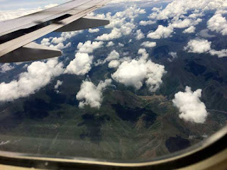
Over beautiful mountainous terrain...
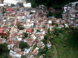
About to make an exciting landing...
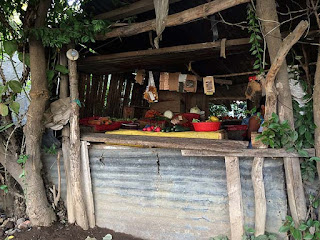
A fruit stand in the village. Those carrots on the left were as big around as an average sized glass.
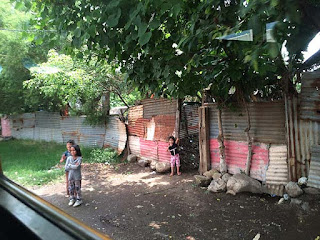
I don't want to show too much about the private dwellings, but this picture and the ones below will give you an idea.
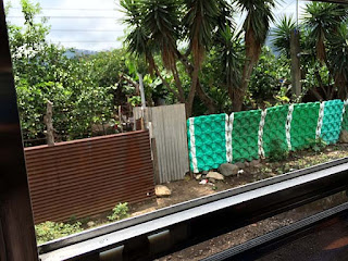
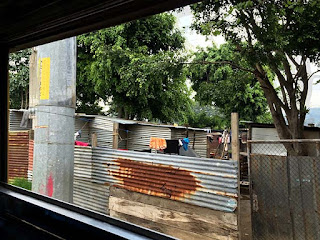
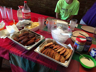
Folks gotta eat. There is nothing quite like meshing with another culture.
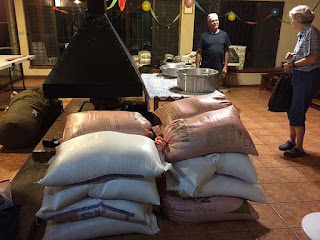
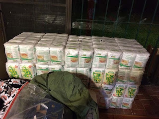
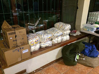
Again, folks gotta eat. The picture above and the two below show some of the food donations. Thanks to a lot people in our church (and not in our church), we were able to provide NUTRITION for others!
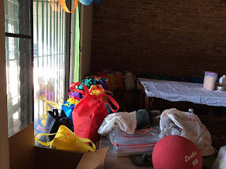
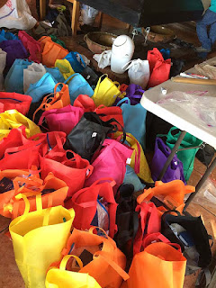
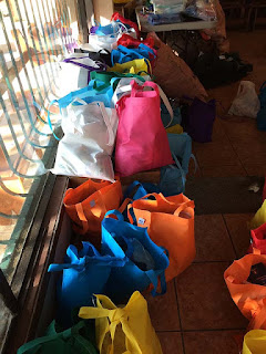
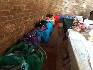
 Yay! Colorful bags with things people need, physically and spiritually. Thanks to the Gideons, we were able to include a Spanish New Testament with every bag.
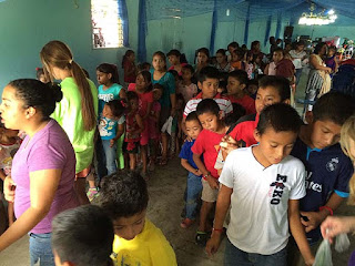
At the end of Bible school, we passed out toy bags full of things that had been donated by friends in the USA.
Our hosts met us and our numerous bags with an "autobus." Guatemala City apparently has no public freeways. Twist. Turn. Turn. Twist. Turn within 3 inches of a corner. I greatly admire the skill of the bus driver. After about 45 minutes, we came to the compound, a spacious house with dorm-style bedrooms. The compound is on Lake Amititlán, and it is truly beautiful.
We ministered to a small village near Guatemala City. I will admit that it was an eye-opener. I don't think of myself as materially rich, not at all. But to many of these people, my modest dwelling would seem to be a palace. I didn't have time to feel sad--no time for paralysis. We needed to be about the Lord's work, performing the tasks that we had been anticipating for months.
While the men were building a small house for a family there, the rest of us taught Bible school, reading Bible accounts in Spanish, managing projects, teaching them about Jesus, and just talking to them in general. Here are a few pictures of what we did.

Over beautiful mountainous terrain...

About to make an exciting landing...

A fruit stand in the village. Those carrots on the left were as big around as an average sized glass.

I don't want to show too much about the private dwellings, but this picture and the ones below will give you an idea.


Folks gotta eat. There is nothing quite like meshing with another culture.

Again, folks gotta eat. The picture above and the two below show some of the food donations. Thanks to a lot people in our church (and not in our church), we were able to provide NUTRITION for others!


 Yay! Colorful bags with things people need, physically and spiritually. Thanks to the Gideons, we were able to include a Spanish New Testament with every bag.
At the end of Bible school, we passed out toy bags full of things that had been donated by friends in the USA.
Every generous act and every perfect gift is from above, coming down from the Father of lights; with Him there is no variation or shadow cast by turning.
--James 1:17 Holman Christian Standard Bible
Wednesday, May 21, 2014
How to Stitch Your Artwork Seamlessly in Photoshop Elements
When joining components of one
artwork in Photoshop Elements, you do not have to settle for a file with an
obvious seam where no seam should be. Using the Eraser and Clone tools, you can
eliminate the seam manually, and with some practice, you can do it so well that
no observer will guess that you have stitched the parts together.
This works with artwork or photos, but in this article I will refer to the subject as artwork. At the end of this post, I include images that I have stitched together using this method.
This article assumes that you know how to get your artwork onto the computer, and that you are somewhat familiar with Photoshop Elements. Before trying this exercise, please read through the entire article including the tips at the bottom. You may have some questions that will be answered there.
These directions focus on Photoshop Elements 7, but I formerly used version 2, and that is where I first began to practice this technique.
If you know how to place the layers together in one file, overlapping to match the edges, skip to Number 6. I now launch into the steps:
Instructions
Things
You'll Need:
- A copy of the Photoshop Elements program. This lesson mainly addresses version 7
- Artwork that has been scanned in two pieces, which can overlap enough to give you some room to erase. Alternatively, you may use two photos that you would like to stitch together
- Step 1
Open
Photoshop Elements and load the two "half files" of your scanned
artwork. If your files have just been scanned and have not been saved, click
"File > Save As" for each separate file and save it as a PNG or
PSD. When your files have been saved, go back to the file menu and click
duplicate for each file. (On older versions of Elements, the duplicate function
is under "Image".) Close the original files, leaving the duplicated
files on the screen. Now you won't have to worry about messing up your original
files. If something goes horribly wrong with your file, you still have the
original pieces.
- Step 2
Let's pretend
the two artwork files are 2500x2000 (meaning 2500 pixels in width), and will be
placed side by side. You're going to make a new file to house the two artwork
files. I would make the new file 5200x2200 pixels, because I want to double the
width and add a few pixels all around for elbow room.
Click "file > new > blank file." In the small box, enter 5200 pixels for width, and 2200 for height. Make sure it says "pixels" there, and not inches or something else. At the bottom of the box, you'll see "Color Mode" and "Background Contents." Keep the color mode at RGB. I always make the background transparent because the tiny gray tiles aid in placement.
Click "file > new > blank file." In the small box, enter 5200 pixels for width, and 2200 for height. Make sure it says "pixels" there, and not inches or something else. At the bottom of the box, you'll see "Color Mode" and "Background Contents." Keep the color mode at RGB. I always make the background transparent because the tiny gray tiles aid in placement.
- Step 3
Now you
should have your two artwork files and a blank file with a transparent
background, which looks gray and white. Click on the artwork file that will
become the left side of the artwork. Just to make the move a little easier,
make sure the artwork is side-by-side with your new, transparent file. If your
tool strip is not showing, click "Window" and make sure
"Tools" is checked. Then click the "Move Tool," which is at
the top left of the tool strip on my copy of Elements 7. Place this cursor on
the artwork file and left click. Holding the mouse button down, drag the
picture completely into the transparent file. Then let go. A copy of this
artwork file will be
in the new file, but will also still be in the file from which you took it.
in the new file, but will also still be in the file from which you took it.
- Step 4
To save
RAM, close the picture files, keeping the transparent file with the artwork
halves dragged in. In the transparent file, position the new layer (really the
left half of the artwork) into a comfortable position in the left half of the
file (comfortable for you I mean, not for the layer). Repeat step 3 with the
right half of the artwork, placing it on the right side of the new file.
- Step 5
Now, move
the pieces together, matching them to the best of your ability. In order to see
holistically and in detail, you may have to zoom in and out on the view. Your
arrow keys are valuable while moving the layers. They can move the pieces one
pixel at a time. Of course, one of the pieces will overlap the other--that's
what we want. Switch the arrangement of the layers, putting the lower one on
top. Go with the arrangement that looks more natural. If one of the layers was
scanned in a less than straight position, you may have to click "Image
> Rotate > Custom" and nudge it just a little to straighten it. Do
not worry about extra space around the outside, whether in the picture files or
around the pictures, because you can crop it later.
- Step 6
You have
now put the pieces together and arranged the stacking order for the best view.
Still the view is not so great, because you can see a line where the pieces
overlap. Time to pull out the eraser from the tool strip. Make sure you have
chosen "Eraser Tool," not "Background Eraser," or
"Magic Eraser." In the layers palette, select the top layer.
In the upper left of the main window of the program, click "Default Brushes" and choose a blurry brush. I normally set the opacity to 100%, although it will not be 100% in the blurry edges. The "[" and "]" buttons will change the size of the brush. Now you will carefully erase parts of the overlapping portion of the top layer.
You are trying to make the erased edges blend into the bottom layer so that it appears to be one piece. Be careful not to erase to the point of exposing the transparent background. Stay in the area of overlap. Zoom in and zoom out frequently; zooming out is the equivalent of stepping back to get the whole picture. Don't get frustrated; this may take some practice. I am left-handed and use my right hand on a mouse to do this.
- Step 7
Now you
have erased the overlapping top section to the best of your ability. If you
have not yet saved--you live dangerously by the way--you may want to save now.
Then, go to "Layers" at the top of the main window and click
"Merge Visible." You now have one layer.
- Step 8
Bring out
the Clone Stamp Tool, which is on your tool strip. Use this tool to correct any
portions that you could not erase to your satisfaction. When using the clone
tool, I like to continue to move around with the Alt button--that's the button
that sets the distance from donor site to receiver site. That will keep you
from getting that double and triple patterned look that screams, "Clone
abuse!"
- Step 9
Again,
zoom out to digitally step back and get the whole picture. If you are
satisfied, it's time to crop. Click the Rectangular Marquee Tool on the tool
strip. If you want a certain ratio, go to the top of the main window and click
Fixed Aspect Ratio" on the Mode section; set the desired ratio. Then, crop
the picture. Immediately save the file in a loss-less format such as PSD or
PNG. If you want smaller files and JPEGS for various purposes, duplicate your
new file and close out the hard work that you have just saved, leaving the
duplicate in the window. You have now eliminated the danger of ruining your new
file, and you are free to create the smaller files you need.
·
Make sure you have a nice overlap in the scanned sections. The larger
the overlap, the more leeway you have when erasing.
·
What if you have more than one section to merge? First, I would stitch
two layers together and blend them with the eraser and clone tool. Then I would
merge them to one layer. Then, I would add the remaining layers one at a time,
to the already stitched and blended layers. With each added layer, I would
blend and merge down before adding the next. I have found this method to be
less frustrating. It is much easier than trying to marry four layers at once.
Below are a couple of samples of artwork stitched together in the manner that I have just described.
Below are a couple of samples of artwork stitched together in the manner that I have just described.
Saturday, October 5, 2013
Things are getting exciting. It's Fall now, and Santa is peeking around the corner, trying to nudge the Thanksgiving turkey out of the way. This is one of my Santa portraits.

santa art santa claus art artwork canvas prints artwork prints hand painted framed printsbeautiful greeting cards
beautiful metal prints
Friday, October 4, 2013
And here is a purple still life painting...I used to get daisies once a month, and painted them often. I think the flowers here look very much alive.

The Southwest is in My Blood
I have visited the Southwest about ten times, give or take a couple. When I am there, the time goes by quickly. When I am away from there, the rocks, hills, and mesas call to me. This painting is an imaginary landscape with a partially imaginary rock wall, accented by a tower. The old ruins are made of rock.

Tuesday, September 17, 2013
Still Life Paintings with Pears
Still life with fruit can be a beautiful form of expression. There is the shine, the texture, and the surroundings. In each of these pieces, there are golden pears. In one scene, an apple takes center stage.
pears art artwork framed prints artwork posters hand painted posters
beautiful canvas printsbeautiful paintings beautiful posters
Subscribe to:
Comments (Atom)
